
Drawing diagrams in PowerPoint. How to make a presentation in Powerpoint How to draw a diagram in Powerpoint

Presentation - great way convey information briefly and clearly. We strive to make it beautiful and unforgettable, informative and impressive. However, everyone is already tired of template slides, popular stock images and diagrams. Using outdated techniques and graphics you will no longer be able to produce an effect on the viewer. Below we will look at some fresh ideas that will help convey your information in an interesting and understandable way for everyone.
1. “People” (or about infographics)
Almost all people do not perceive dry statistics well. After all, numbers by themselves do not tell us anything. Therefore, it is very important to present information in such a way that it is perceived on an intuitive level, and the viewer does not have to make a lot of effort to understand and comprehend it. Infographics come to the rescue – i.e. a way of presenting numerical or statistical information in graphical form.
Let's say we want to talk about the fact that only 20% of people with a valid driver's license own a car. Of course, you can write about this in text or make a pie chart, as in this example:
Or you can present the information more clearly. 20% is 1/5, that is, 2 people out of 10 or 4 people out of 20. Let's use this and make a slide in which everything will be obvious:

By adding figures of people and cars, we turned the statistics into an interesting image that not only attracts attention, but also helps the viewer imagine how much it is - twenty percent. While a regular diagram does not have such properties, and generally resembles “pac-man” :)
2. Big numbers
Another way to effectively present digital information is to make the numbers huge. Literally! Let's compare two slides:


The placement of information on the first slide allows us to insert a photo of a cute dog, but on the other hand, this dog distracts attention from the content. The second slide makes you think about numbers. Here we need to start from the storyteller’s task: if the goal is to evoke an emotional reaction, then we use the first slide, if we focus on facts, we use the second.
3. Dark background
Typically, presentations use a light, calm background. Most often this is justified, but you should not be afraid of a dark background. It can be stylish and beautiful! For presentations of watches, jewelry, “luxury” brands, equipment and much more, a dark background is perfect. You don't have to use black; there are a lot of beautiful dark shades.


4. Weighing
When we need to compare two products, evaluate the pros and cons, show the pros and cons, we make lists. And sometimes such reasoning needs to be displayed directly on the slides. The question arises: how to make these studies visual for the viewer and at the same time push him to make the “right” decision? In this case, you can use a little trick and depict scales on the slide. You can use stylized scales, Themis scales, market scales - whatever your imagination and style of a particular presentation allows. The SmartArt Balance object is a joy to use in PowerPoint.
Do you need an iPhone? Let's look at the slides:


Both slides make the same arguments, but in the first case we don't get the impression that an iPhone should be bought. But the second example with scales clearly inclines us to buy =)
5. Maps
We show any geographical data on maps! If we work with clients from other countries, cities, regions, feel free to place a map on the slide and mark these locations with color. Within one city, you can draw a metro map indicating the stations where our sales points are located. Even the most beautiful bulleted list will not give the effect that it does. regular card. And, of course, if we make a map that outlines how to get to our office, clients will be very grateful.
For example, consider two slides:


The first slide simply contains a list of airfields, the second slide contains the same airfields, but linked to a map. Obviously, in terms of perception, the second slide is much more convenient.
6. Drawing
When was the last time you held a pencil in your hands? What for? – you rightly ask. After all, everything is much more convenient and faster on a computer. However, using hand-drawn objects in a presentation can have an unexpected and very powerful effect! This move will be useful for designers, wedding and event planners, furniture manufacturers, and many others.
Let's say we have a furniture store and we want to sell a sofa. How to show the client that our sofa is exactly what he was looking for? Of course, you need to list all its advantages and specifications, but buying is an emotional action. First of all, we need to make a person want to have this sofa at home. Many companies already use a method where the client can upload a photo of his interior and insert products from the store there, selecting the ones that suit him. Unfortunately, this will not be possible in the presentation. But sometimes abstract interior items drawn with a regular white marker advertise a store better than any photographs:

In the example given, we filled the interior of a potential client with simple objects that everyone has and, of course, placed our sofa in the center of the composition. “Flat” details complement the picture of the interior, give it a feeling of comfort, but at the same time do not distract attention from the main thing. The advantage of abstract images is that they leave a lot of room for fantasy and imagination. After all, each person imagines his own interior.
Of course, it is not necessary to literally draw with a marker on a printed picture (although this is quite acceptable, it’s just not convenient for everyone). Any graphics editor allows you to achieve a similar effect.
7. Flowcharts
When there is a need to describe a process in a presentation, lists are often used. In rare cases, pictures are added to them. But a list of 5 or more items is already perceived poorly by the viewer. What if there are more of them? Take the time to create a beautiful and visual flowchart that explains the process in detail. It will significantly save clients time and reduce the number of questions.
Thus, you can schematically depict the work of a workshop or department, the operating principle of a device, the process of interaction between departments, or, as in our case, the process of ordering a presentation in the Mikhail Tsarev Studio:

Be creative, look for new ideas and don’t be afraid to surprise!
P.S. All data and statistics used in the examples are fictitious, and any similarities are random 😉
Have you encountered SmartArt? Just in case, I repeat - SmartArt is graphic objects and diagrams designed to present your information in a convenient and beautiful view. In terms of its “meaning,” SmartArt in PowerPoint is most similar to design themes. Its use solves two problems at once: firstly, it provides a “professional” look to your slide show, and secondly, it does it in record time - right away.
To make it clear, I'll start with an example:
Let's say I have a simple bulleted list, but I don't have time to design it.
Simple Bulleted List in PowerPoint
Now let's convert my list into a SmartArt object:

The same list, but converted to a smartart object
It's a completely different matter - it looks like I spent an hour creating the graphics. Already interested? Then let's get straight to practice.
Create a SmartArt object inPower Point
In general, you can get your own SmartArt in two ways: create it from scratch and convert existing text, as I did in the example.
We'll take the simple route and create a new empty object using the template:
- Go to the Insert panel and click the SmartArt button in the Illustrations group.
- A new window opens with a bunch of elements; for example, click on the first one that comes across and add it to the slide.
I added a “vertical bullet list” and turned it into a little shopping list. Please note - when you type in SmartArt new line, all other lines are automatically reduced in size and do not extend beyond the slide.

SmartArt shopping list
The appearance of a SmartArt object can be changed either by switching standard PowerPoint styles (in the Design panel) or by special styles for SmartArt objects on two additional panels that appear when you select an object: “Designer” and “Format”.

Let's play with the SmartArt object settings
The Design panel contains the most useful editing tools:
- The “Drawing Creation” group allows you to change the order of lines (up and down buttons), raise or lower a line in the hierarchy (“demote” and “promote”).
- The Reset group allows you to convert your SmartArt object to a simple text bulleted list (“Convert”).
- The Layouts group allows you to change the basis of a SmartArt object on the fly without losing data.
I changed the SmartArt representation of the object to something more suitable for me and changed the order of the lines - food is more important to me :).

Final view of the shopping list for the presentation
How to turn text into a SmartArt PowertPoint object?
If you want to turn an existing bulleted list into a beautiful SmartArt object, that’s also possible. To do this, copy the list onto the slide, select it, and in the “Home” panel, in the “Paragraph” group, click the “Convert to SmartArt” button. All that remains is to select the appropriate type from those offered, or by clicking the “Other SmartArt graphic elements” button, go to them full list. Objects and images are converted into SmartArt in the same way.
I would like to note that SmartArt is a very multifaceted tool and its use is not limited only to lists and illustrations of relationships. You can also draw pretty nice block diagrams in it, like this one:

Graphic diagram in PowerPoint made using SmartArt
I think they will decorate any electronic presentation.
A small cheat sheet of where and why different types of SmartArt are used:
- “Process” and “List” are similar in that they have a strict hierarchy - “2” comes after “1”, and “4” does not appear until “3” appears. If consistency is important, that's your choice.
- “Communication” is intended to show options for the development of a situation as a result of some events.
- “Cycle” itself reflects repeating chains of events.
- “Matrix” - shows the relationship of components to the whole.
- "Hierarchy" is the ideal form for general block diagrams.
A flowchart is designed to show a task or process in sequence. Such maps are often required to create business diagrams, models, showing production processes and tasks. There are various methods you can use to create flowcharts in PowerPoint, including using SmartArt Graphics, shapes, and pre-made templates.
How to Create Diagrams with SmartArt in PowerPoint
The best method for creating diagrams on your own is using SmartArt Graphics in PowerPoint. Microsoft This method is even recommended in the Office.com support section. Below is a complete guide that shows you how to create a flowchart using SmartArt.
Select A SmartArt Graphic
In the first step, go to Insert->SmartArt and select a graphic to create a flow diagram. There are various graphics that you can use for this purpose, however, the best SmartArt graphics include those in the sections lists, process, cycle, hierarchy And relationship.

Add description Process Information
In the next step, fill out the boxes to create a sequential flow chart for the production process. When creating a flowchart, make sure that the shapes you use are properly placed.

Add Forms To The Flowchart
You can add additional shapes to your flowchart from the Add Shape menu in SmartArt Tools. This may allow you to add additional shapes to the flowchart.

Changing Shape Type , to reflect the Right symbol
As mentioned earlier, the various flowchart shapes represent different meanings, That's why; It is important to use the correct form for each section of the flowchart. You can format the block diagram form by right-clicking on the form and going change my form. As you can see in the screenshot below, you can select specific flowchart shapes from this menu. If you are not sure which form to use; Hover your mouse over the form for its name to appear.
Note: Each flowchart shape has a special meaning, make sure you use the right shapes to show the process in sequence. To see the meaning of different shapes in a flowchart check out our post: Meaning of various Block symbols - scheme.

Formatting block - Design schemes
You can customize your block diagram to give it the appropriate design using SmartArt styles. Additionally, you can change the colors for your SmartArt Flowchart from the menu Color change(in SmartArt Tools). Additionally, you can select the background color for the slide from the tab Design in PowerPoint.

Sample Flowchart Made with SmartArt Graphics in PowerPoint
The image below shows an example made with a SmartArt Graphics Flowchart in PowerPoint.

How to Create Diagrams with Shapes in PowerPoint
You can also make flowcharts using a form. To add shapes in PowerPoint, go to Insert > Shapes.

After selecting the desired shape, drag the cursor onto the slide to form the selected shape.

To format a custom form, select the form and go to quick styles or use the many options that will appear on menu ribbon V drawing tools.

The screenshot below shows an example of a flowchart created using shapes in PowerPoint.

Flowchart PowerPoint Templates
If you find it too time-consuming to create flowcharts using shapes or SmartArt, then you can opt for Flowchart for PowerPoint templates. Below are some customizable PowerPoint templates that you can use to create flowcharts.
Process Flow Template for PowerPoint
This is an excellent premium flowchart template for PowerPoint that provides an editable process flowchart that can be used to produce an algorithm flowchart in no time. This template comes with a set of sample slides that offer different flowchart selections that can be customized to suit your needs.
Go to download Process Flow Diagram Template for PowerPoint

Free Process Flow Template for PowerPoint
This is another great sequence flowchart template with various sample slides that provide sample diagrams. This template even comes with a standalone slide with given graphics to help you copy/paste shapes across different slides for convenient creation block diagrams.
Go to Download Free Process Flow Diagram Template for PowerPoint

Free Simple Process Diagram PowerPoint Template
This is another one free template flowchart of an algorithm that can be used for making regular and business circuits. While the sample slides in this template look less like a typical flowchart, however you can navigate through the shapes and arrows to easily build a decent flowchart with some nice graphics.
Go to Download Free Simple Process Diagram PowerPoint Template

Besides PowerPoint, you can also draw flowcharts using various third-party tools. For more details see our post on Highest Paid Cartographic Makers Free Flow or you can download charts and diagrams for PowerPoint presentations.
A presentation is a great way to convey information concisely and clearly. We strive to make it beautiful and unforgettable, informative and impressive. However, everyone is already tired of template slides, popular stock images and diagrams. Using outdated techniques and graphics you will no longer be able to produce an effect on the viewer. Below we will look at some fresh ideas that will help convey your information in an interesting and understandable way for everyone.
1. “People” (or about infographics)
Almost all people do not perceive dry statistics well. After all, numbers by themselves do not tell us anything. Therefore, it is very important to present information in such a way that it is perceived on an intuitive level, and the viewer does not have to make a lot of effort to understand and comprehend it. Infographics come to the rescue – i.e. a way of presenting numerical or statistical information in graphical form.
Let's say we want to talk about the fact that only 20% of people with a valid driver's license own a car. Of course, you can write about this in text or make a pie chart, as in this example:

Or you can present the information more clearly. 20% is 1/5, that is, 2 people out of 10 or 4 people out of 20. Let's use this and make a slide in which everything will be obvious:
By adding figures of people and cars, we turned the statistics into an interesting image that not only attracts attention, but also helps the viewer imagine how much it is - twenty percent. While a regular diagram does not have such properties, and generally resembles “pac-man” :)
2. Big numbers
Another way to effectively present digital information is to make the numbers huge. Literally! Let's compare two slides:
The placement of information on the first slide allows us to insert a photo of a cute dog, but on the other hand, this dog distracts attention from the content. The second slide makes you think about numbers. Here we need to start from the storyteller’s task: if the goal is to evoke an emotional reaction, then we use the first slide, if we focus on facts, we use the second.
3. Dark background
Typically, presentations use a light, calm background. Most often this is justified, but you should not be afraid of a dark background. It can be stylish and beautiful! For presentations of watches, jewelry, “luxury” brands, equipment and much more, a dark background is perfect. You don't have to use black; there are a lot of beautiful dark shades.
4. Weighing
When we need to compare two products, evaluate the pros and cons, show the pros and cons, we make lists. And sometimes such reasoning needs to be displayed directly on the slides. The question arises: how to make these studies visual for the viewer and at the same time push him to make the “right” decision? In this case, you can use a little trick and depict scales on the slide. You can use stylized scales, Themis scales, market scales - whatever your imagination and style of a particular presentation allows. The SmartArt Balance object is a joy to use in PowerPoint.
Do you need an iPhone? Let's look at the slides:
Both slides make the same arguments, but in the first case we don't get the impression that an iPhone should be bought. But the second example with scales clearly inclines us to buy =)
5. Maps
We show any geographical data on maps! If we work with clients from other countries, cities, regions, feel free to place a map on the slide and mark these locations with color. Within one city, you can draw a metro map indicating the stations where our sales points are located. Even the most beautiful bulleted list will not give the same effect as a regular map. And, of course, if we make a map that outlines how to get to our office, clients will be very grateful.
For example, consider two slides:
The first slide simply contains a list of airfields, the second slide contains the same airfields, but linked to a map. Obviously, in terms of perception, the second slide is much more convenient.
6. Drawing
When was the last time you held a pencil in your hands? What for? – you rightly ask. After all, everything is much more convenient and faster on a computer. However, using hand-drawn objects in a presentation can have an unexpected and very powerful effect! This move will be useful for designers, wedding and event planners, furniture manufacturers, and many others.
Let's say we have a furniture store and we want to sell a sofa. How to show the client that our sofa is exactly what he was looking for? Of course, you need to list all its advantages and technical characteristics, but buying is an emotional action. First of all, we need to make a person want to have this sofa at home. Many companies already use a method where the client can upload a photo of his interior and insert products from the store there, selecting the ones that suit him. Unfortunately, this will not be possible in the presentation. But sometimes abstract interior items drawn with a regular white marker advertise a store better than any photographs:
In the example given, we filled the interior of a potential client with simple objects that everyone has and, of course, placed our sofa in the center of the composition. “Flat” details complement the picture of the interior, give it a feeling of comfort, but at the same time do not distract attention from the main thing. The advantage of abstract images is that they leave a lot of room for fantasy and imagination. After all, each person imagines his own interior.
Of course, it is not necessary to literally draw with a marker on a printed picture (although this is quite acceptable, it’s just not convenient for everyone). Any graphic editor allows you to achieve a similar effect.
7. Flowcharts
When there is a need to describe a process in a presentation, lists are often used. In rare cases, pictures are added to them. But a list of 5 or more items is already perceived poorly by the viewer. What if there are more of them? Take the time to create a beautiful and visual flowchart that explains the process in detail. It will significantly save clients time and reduce the number of questions.
Thus, you can schematically depict the work of a workshop or department, the operating principle of a device, the process of interaction between departments, or, as in our case, the process of ordering a presentation in the Mikhail Tsarev Studio:
Be creative, look for new ideas and don’t be afraid to surprise!
P.S. All data and statistics used in the examples are fictitious, and any similarities are random 😉
Making presentations is an art that is not easy for beginners. Read on to learn how to make your presentation interesting.
Along with Microsoft Word, PowerPoint is included in the list of programs that a confident PC user should be able to use ( personal computer). Therefore, sooner or later at least a basic understanding of this computer program It may come in handy for many people - at least it will be an additional plus on your resume.
Creating presentations is not difficult, and we will prove it to you with examples. Step by step we will describe the algorithm for creating the main elements of a good presentation, and for a general understanding we will use screenshots.
How to make an interesting presentation in powerpoint
Most people tend to attach importance to the color palette. It has been scientifically proven that color can influence human behavior, physical and emotional reactions. Color attracts attention and interests, which is why we recommend using a background when creating presentations.
Please note that the background should be appropriately combined with the topic and purpose of your presentation. In business or educational presentations, a calm color palette is encouraged.
To a question, how to make a background in a powerpoint presentation? - Remember [before this, create a slide by selecting the appropriate layout: in the main panel, click “create slide” - “layout”]. To add a background to a slide, a few clicks of the mouse will be enough. In the same top panel line, click “Design” and select one of the proposed options.
You also have plenty of ways to add variety to your background. Additional options include replacing background colors, background styles, and fill patterns. Go to " Extra options" - "Background styles" - "Background format". And here is already an “unplowed field” for experiments: solid fill, gradient fill, pattern or texture, pattern fill.
The secret of successful presentations - literally in plain sight - is encrypted in the very word “presentation”. Translated from Latin it means presentation. In modern realities, presenting only pictures with a signature will not surprise anyone, so other methods are used. One of them is a diagram.
Diagrams can be different (linear, circular, bar, curly). Depending on your goals, you can use any - the presentation contains them all. Toadd a diagram to a presentationin the top panelClick “Insert” - “Diagram” - select the appropriate one from the list of templates - “OK”. A diagram will immediately appear on the slide layout.

To adjust its indicators or change the color, just click on the diagram with the left mouse button - and a column of buttons for adjustment will appear in the upper right corner of the diagram.
To make your presentation unique, you can also use a slide show. Most often, this opportunity is used to create congratulatory presentations dedicated to some celebration (for example, a slide show from a wedding day).
Keep it up, and then you’ll tell your friends,How to make a slideshow in a powerpoint presentation.
As you probably already guessed, there is nothing complicated. In the same top panel, in the “Insert” tab, go to “Photo Album” - “Create Photo Album”. In a new window, you select pictures from folders on your PC. After you have added the necessary pictures to the album, do not forget to select the so-called picture layout in the same window (one picture is included in the slide, or there can be several of them, plus headings). To save the selected changes, click the “Create” button.
For a high-quality slideshow, we always recommend adding sound. This is not difficult to do. To do this, go to the “Sound” option and select “Audio recording from computer” / “Record sound”. The added audio icon appears on the first slide. Also, always add transitions between slides - this will make your impromptu “show” especially interesting. Just a few clicks: “Animation” tab - “Transition selection” - apply to all slides or to each one individually.

Returning to presentations as a business or educational tool, it would be a good idea to learn how to make diagrams. So,how to make a diagram in a presentation?
To create diagrams, the easiest way is to use figures already prepared in the presentation database. In the already familiar “Insert” tab, select “Shapes” or “SmartART”. To add them to a slide, just one click with the left mouse button is enough.

Please note that an interesting and high-quality presentation should consist not only of pictures, diagrams and diagrams. Information content plays an equally important role. Tomake text in presentation, a few clicks will also be enough.
On the new slide, use the left mouse button to move italics and type the text you need. In the top panel, in the “Main” tab, you can also format your text entry: select the font and size, change the color of the letters and the location of the text.

If you want to select a picture or text fragment, we recommend using a proven method - andmake a presentation frame. In the same “Main” tab, in the “Drawing” section, pay attention to “Shape Fill” and “Shape Outline”.
Let's use a photo as an example. Having inserted a photo into your layout (using a simple algorithm for this: “Insert” - “Drawing”), go to the “Main” tab, left-click on the selected photo and in “Figure Outlines” select the thickness and color of your outline - framework.
Also, to create a frame, you can use “shapes”: “Insert” - “shapes” - “basic shapes, baguette frame” - insert into the layout and stretch it along the left side of the layout with the left mouse button.
Then right-click on this part of your frame - “shape format” - “fill / for example, gradient fill” [you can select any other one, play with the color]. Copy the resulting side of the frame (with the right mouse button) and paste it on the right side, at the top and bottom of the layout.

To make a presentation interactive (interactivity implies user participation or influence in the presentation process), you need to add hyperlinks to the presentation.
So, how to make an interactive presentation in powerpoint?
Select some object, for example, a piece of text to which you want to attach a hyperlink. And on the standard toolbar, click on the “Add hyperlink” button.
The specificity of hyperlinks is the need to link them to a specific address, in our case, to another slide. For example, if your first slide talks about something that is covered more on the third slide, then follow this outline:

There is no need to be afraid of working with a presentation. As you can see, it's much easier than it seems. Moreover, in the end, it is also much more fun than a typical homework assignment (if you are a student) or an official paper report.
Don’t know what an electronic presentation is and why it is needed? In this material, you will not only get answers to these questions, but also learn how to create your own presentations using the popular PowerPoint 2010 application.
Introduction
Surely many of you still know or even remember what filmstrips are. In the 70s of the last century, home cinema was considered a miracle. At that time there were no VCRs, no personal video cameras, or other means of recording and playing video available to the masses. Instead, images (slides) printed on ordinary positive photographic film were used to visually narrate or tell, for example, a story. The frames, which were shown in an enlarged size on the screen sequentially one after another, as a rule, were connected by a certain thematic line and provided with test comments.
Filmstrips were widely used for educational, entertainment, lecture and artistic purposes, successfully replacing expensive film screenings at that time. Some filmstrips were even produced with sound on vinyl records or magnetic tape to improve the viewing experience for viewers.
In the early 90s, thanks to the mass distribution of household video recorders, filmstrips were almost completely forced out of our lives, and it would seem - forever. But once again the proverb that everything new is well forgotten old worked. In our era of rapid development of computer technology, the seemingly unnecessary slide film has returned, under the fashionable name “presentation”.
Indeed, if previously the lion's share of filmstrips was aimed at children and was of an entertaining nature, then the presentation is a tool for an adult audience. Student and scientific works, announcements of new developments in production and business areas are held, new products are demonstrated or advertised. Of course, presentations are not limited to the business sphere. If desired, you can arrange a family album, photo report of a wedding or birthday in this way.
The most popular program among presentation preparation systems is definitely the PowerPoint application, which is included in Microsoft package Office. At the same time, PowerPoint has very few or virtually no worthy analogues and competitors. With its help, you can turn graphic, text and numerical information into colorfully designed slides and diagrams, providing them, if necessary, with animation and sound.
Application structure and interface
When you start learning applications like Word or Excel, you often come across concepts that you understand intuitively. After all, even from school, everyone knows what text is and how it should be placed on a page, why a paragraph is needed or how a table is built, what rows or columns are, and so on. In PowerPoint, however, you will have to deal with new definitions, which may initially make the process of perceiving information somewhat difficult.
The basis of any presentation is a set of slides or frames, which may contain: images, graphics, texts, videos, sound and other objects. So, before creating a new presentation, it is better to prepare in advance all the materials that will be included in it (photos, videos, diagrams, etc.), structure them if possible, and put them in a special folder. This will save you a lot of time and confusion later on.
Upon launching PowerPoint for the first time, people who are already familiar with Word or Excel will immediately recognize the signature user interface found in the latest packages Microsoft Office. As always, the main control tool is located at the top of the window - Ribbon, with a set of thematic tabs and groups of commands. Directly above it are the quick launch bar, title area and standard window control buttons.

The work area located immediately below Ribbon and occupying almost the entire remaining space of the window, is divided into four parts: on the left there is a thumbnail area with tabs Slides And Structure, in the center is the sheet of the slide itself, and below it is a field for notes.
All tools for creating and working with presentations are located on Lente, which has several thematic tabs, such as: File, home, Insert and others. Each of these tabs contains commands and controls that are organized into groups. The buttons in each group can perform either a separate action or contain an entire menu of commands.
To increase your workspace, you can minimize the ribbon by double-clicking on the name of the active tab or on the arrow in its upper right corner. The tape unfolds in the same way.
Creating a presentation
There are three ways to create a new presentation: using a template, based on a theme, and using an existing presentation.
PowerPoint contains a considerable number of thematic presentation templates, where the slides are already designed in a certain way. All you have to do is insert your text, images, charts and tables into them without worrying about the artwork. Of course, you can later change the design of any template to your liking. But in our first presentation we will take a more thorny path and create it from scratch without software assistants.
Immediately after launching the program, we see the first (initial) slide of the presentation, which is called the title slide, and is a completely white sheet with two rectangular text areas: Slide Title and Slide Subtitle.
Click on the required area and enter the desired text. At the same time, you can format the text using the commands located on Lente, on the tab home in Group Font. Here, as in the Word editor, you can set: font type, size, emphasis and color, select the text alignment direction, change the spacing between characters, etc. We will not dwell on this in more detail here, since you can learn about the text formatting functions in the Word training materials.
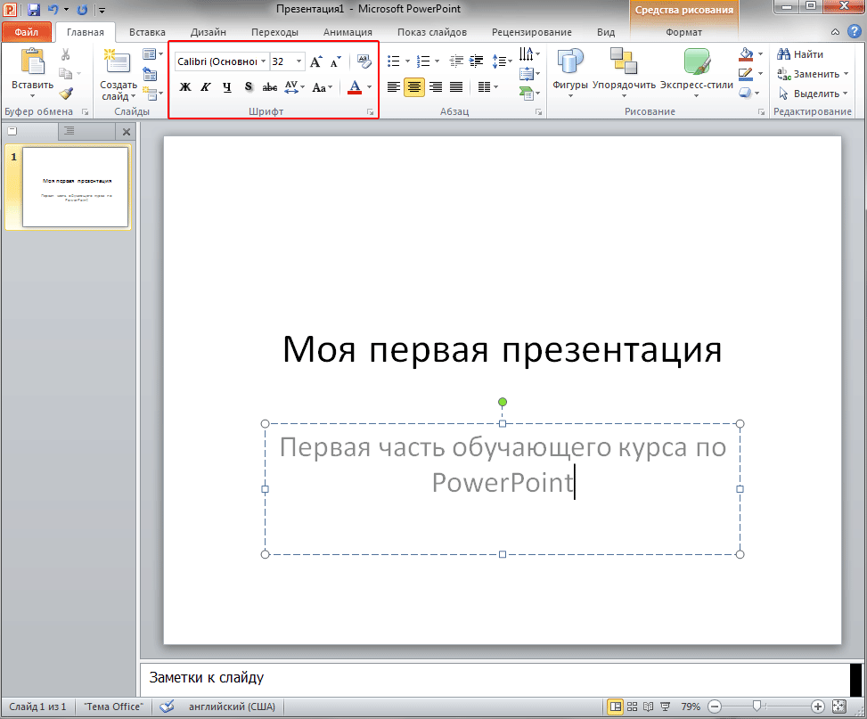
Please note that each text area while it is being edited, it is outlined with dotted boundaries indicating its current size. There are dots placed in the corners and in the middle of the sides of the area, which you can drag to change its size. The area's boundaries are used to move it, and the green dot is used to rotate it.
Add slides, choose a layout, apply themes
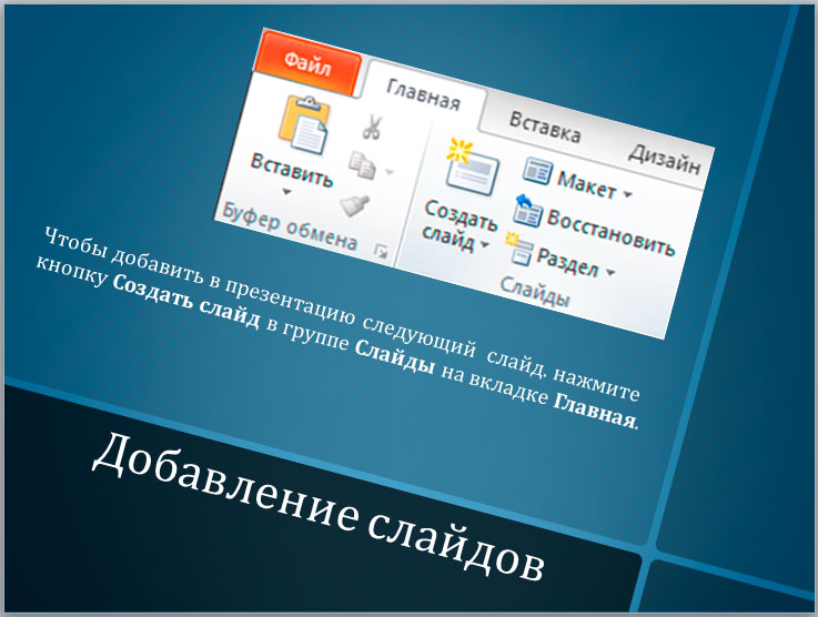
After completing the title slide, let's add the next slide to the presentation. To do this, click the button Create slide in Group Slides on the tab home.

As you can see, the placeholders (areas to fill) of the second slide are somewhat different from the title slide, since it is already intended directly for entering the content of the presentation itself. The upper area for the title here is text, but the lower, larger one, can contain not only text, but also tables, charts, images or multimedia clips. To add all this variety, there are buttons with thematic icons in the center of the document workspace.
The relative position of placeholders on a slide and the type of content they contain in PowerPoint is determined by the layout. The button is responsible for changing the layout of the selected slide. Slide layout in Group Slides, when clicked, a pop-up window appears where you can select a different standard arrangement of elements.

By default, the slide will have a Title and Object theme applied to it. If this option for arranging elements does not suit you, then at any time you can choose another theme that has a more suitable layout.

In our example, we chose the theme “Two Objects” for the second slide. On the left side text was entered in the form bulleted list, and on the right, to give the table of contents a more colorful look, we inserted a picture. Inserting a picture is done by clicking on the corresponding icon and then selecting the location of the desired file.

Now let's add a third slide. Please note that each new slide is inserted after the slide that was current at the time of insertion. That is, if you had the second slide selected, then the third will be inserted immediately after it, and if the first slide was selected, then the new slide will be inserted between the first and second slide. In this case, each new slide will have the same layout as the slide after which it was inserted.
Thus, in our case, the theme “Two Objects” will be automatically applied to the third slide. However, here we will use a different arrangement of elements, so we will change the layout again to “Title and Object” and fill the fields with the necessary text.

To give your presentation a more professional look, you can apply one of the themes. A theme in PowerPoint is a set of specially selected color schemes, a set of fonts, and effects applied to certain objects.

To select a theme, open the tab on the ribbon Design. Thumbnails with topics are located almost in the center of the tab and occupy most of it. To the right of the thumbnails are arrows for scrolling and a button Extra options, by clicking on which you can open a pop-up window with all the built-in themes.

If you hover your mouse over any of the theme thumbnails, you can immediately see in real time what the slides will look like after applying it. This is very convenient and allows you to look at your presentation in different designs by simply moving the mouse cursor from one thumbnail to another.
Changing the size and location of aggregates. Inserting new objects
Placeholders on slides are designed to make it easier for users to place presentation elements. However, sometimes their location and size may not meet the desired criteria. For example, the text area may be too small or the title may be misaligned. This can be easily fixed in PowerPoint.
After clicking on any element of the presentation, a frame with markers will appear around the selected object. To change the size of the area, you need to move the mouse cursor over any white marker (the cursor will change to a double arrow), and drag it in the desired direction while holding down the left mouse button. Corner markers are used to change sizes proportionally. In the same way, you can move the selected area with all its contents, only to do this you need to hover the cursor over the frame itself (the cursor will change to a crosshair of arrows). Finally, you can rotate the selected element using the green handle (the cursor will change to a rounded arrow).
In addition to changing the relative position and size of elements on a slide, you can add new objects to it at any time. This is done using the tab Insert on the tape.
You can insert tables, charts, SmartArt and WordArt objects, all kinds of images and illustrations, text, formulas and symbols, date and time, videos and audio tracks, as well as Flash videos into slides. Thus, PowerPoint allows you to create truly professional presentations for every taste with many interactive elements.
Of course, fillers can be inserted not only into ready-made slides, but also into new ones. Let's go to the tab home and in the group Slides let’s click not on the big icon for creating a slide, as we did earlier, but on the button under it with an arrow and an inscription Create slide. What is the difference here? The fact is that this method of adding a new slide allows us to select the appropriate layout for it manually before creating it, while in previous cases the theme was set automatically.

So, after clicking on the button, a pop-up window will open in front of us, where we can select the appropriate layout for the next slide. Let in our case it be “Empty slide”.

Now, after creating the slide, you can go to the tab Insert and practice inserting any objects. As an example, we inserted a previously prepared drawing depicting a piece of tape (button Drawing in Group Images) and two text fields (button Inscription in Group Text).
The drawing was initially small, so we enlarged it to the required size, then rotated it relative to the lines of the layout and moved it to the desired area. All this was done in the ways discussed earlier in this chapter. The text placeholders were also rotated and moved to the right places, and the required font size was set inside them.
View and save a presentation
Once you've prepared a few slides, it makes sense to see how the fruit of your labors will look in full screen mode, that is, in the mode in which your audience will view them. To do this, on the ribbon, go to the tab Slide show and in the group Start slide show click the button At first. It's even easier to start a presentation by pressing the "F5" key.
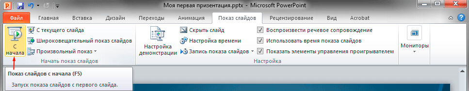
In slide show mode, the presentation will fill the entire monitor screen. You can use several methods to switch slides. The first is to simply click the left mouse button, the second is to use the navigation bar buttons that pop up when you move the cursor to the bottom edge of the screen.

By the way, there is also a button here that allows you to go to a specific slide and perform a number of other functions, for example, exit the presentation. You can also end the slide show at any time by pressing the “Esc” button.
As a rule, while working on a presentation, the created file is saved repeatedly in automatic mode. But in any case, you will have to make the first save yourself, indicating the name of the presentation file and its storage location on disk. You can do this while working on a document by clicking on the bookmark File on the ribbon and selecting the command Save, and before closing the file for the first time by clicking on the button Save, which will be located in the pop-up window. To create a copy of the presentation file, use the command Save as.
Conclusion
So, today you learned the basic principles of creating your own presentation in the PowerPoint application, which is part of the Microsoft Office suite. As you can see, the slide filling mechanism various content It is quite simple and should not cause any particular difficulties even for novice users. Another thing is the very idea of the presentation and the development of its style. It is the quality of elaboration of these issues that will largely determine how successful the presentation of your ideas in this form will be.
Remember that presentation is all about visual presentation of material. So in general try to use more graphic images or videos, minimizing text information. At the same time, the text phrases used should be concise, like headings, and the text itself should be large and easily readable from the screen.
On the other hand, you shouldn’t get too hung up on these rules. Presentations can have different directions and therefore vary greatly in their meaning and goals, and therefore have completely different content. For example, in educational presentations, having a large amount of text may be justified in some cases. In any case, the main thing is to convey the material to the target audience in the simplest and most visual way without losing information content and the general essence.
Publications on the topic
-
 Add to favorites Script to add to favorites for all browsers
Starting today I will tell you about one useful function on the site - this is a link, well, or a button “Add to bookmarks (favorites)”. This feature...
-
 How to remove non-reciprocal readers (followers) on Twitter Who are unfollowers
Twitter is becoming more and more integrated into modern life. Not only is the service very interesting, but its use...